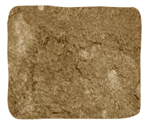
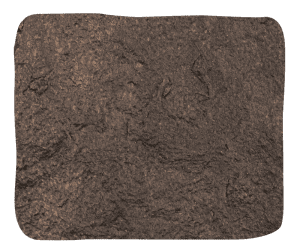
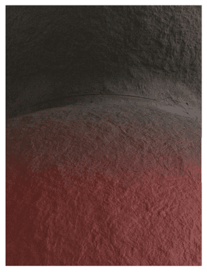
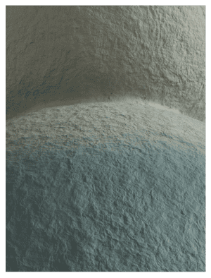
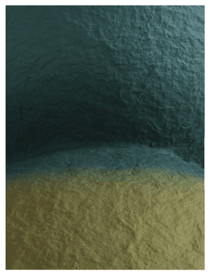
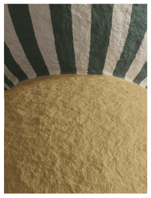
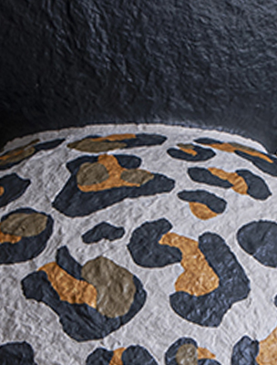
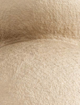
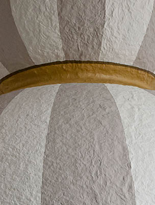
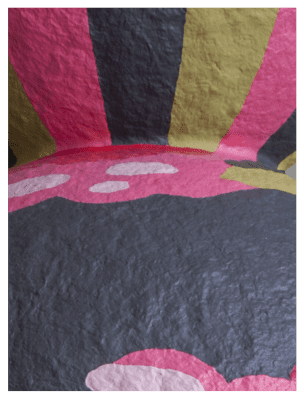
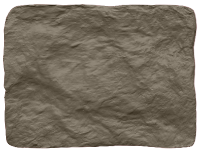
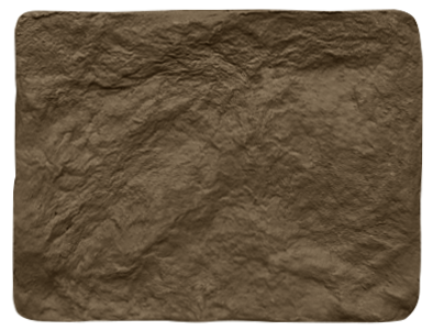
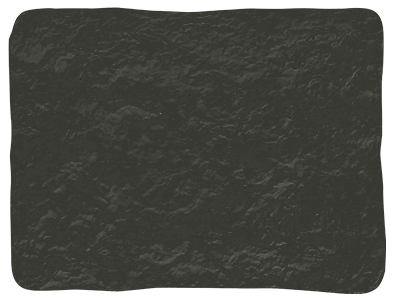
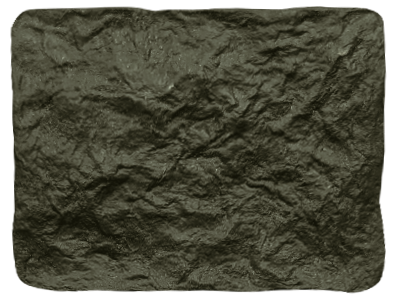
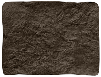
Our colours are difficult to convey in ordinary words.
Like taste and smell, colour also gradually unfolds under different circumstances and lighting. That is why it is extremely important to study its composition and make a decision knowing what to combine it with.
The paints we use contain up to 7 pigments, while colors containing more than three or more are considered complex.
Not only such color names as “black” and “blue” will be insufficient, but also “coal” and “cobalt” will not convey all the complexity of shades and the importance of their correct combination with other interior objects.
That is why in this section you can find detailed descriptions of each shade of our palette with comparisons, references and recommendations for combinations

PAINTED SURFACES

07. Dry Olive

46. YELLOW-PINK

122. MIDDLE BUFF

72. Olive Colour

79. NORMANDY GREY

114.MID LEAD COLOUR

208.HICK'S BLUE

143. ROLLING FOG

37. Stock

11. powder beige

228. LAMP BLACK

222. Loft White

silver *

gold*

* only for painting lamps from the inside
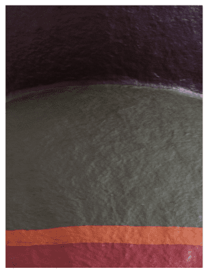
TINTED BIOCOMPOSITE. HLYBYNA PALETTE

Vapniak

Suhlynok

VOCHRA

Brunat

DEREN

Chornozem

ceramic color palette MAKOSH

cream

pumpkin

chocolate

THE COLOR OF THE METAL CASE

9001

1036

3012

8019

CUSTOM COLOR SOLUTIONS

Okhra smuzhka

Bagryanyi gradient

BLAKYT GRADIENT

SMARAGD GRADIENT

SMUZHKA MED

POPIL GRADIENT

ROZPYS malva

SMUZHKA SIRYI

SERPNEVE

VERESNEVE

PERLA

BARVYSTE

EARTH PIGMENTS OF KHMYZ COLLECTION

12. Warm Stone

10. Fog Beige

18. SILT

20. TREE BARK

01. Graphite Black​

17. GLEY

19. FOREST SHADE

21. DARK BRONZE

Mineral finishes

22

23

FURNITURE COLORS

9016

7015

7021

1019

CORD COLORS

9016

7015

7021

1019